Getting Around the Management Suite
Logging In
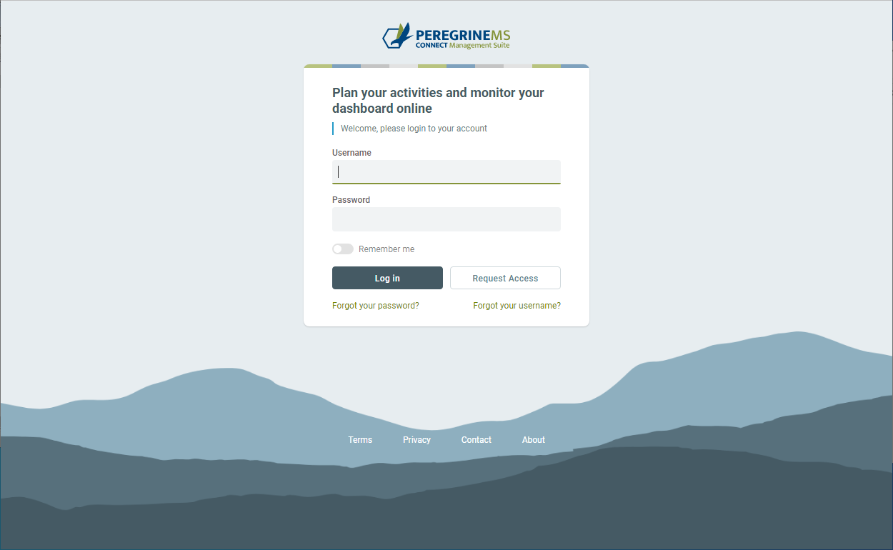
The page below shows the login greeting page when you first navigate to the Management Suite home page. You are prompted for a username and password. Depending on how Management Suite is configured in your organization, you may enter your active directory username and password or your username and password that has been assigned to you by an Administrator. If using an assigned username and password, you will be prompted to change password on first login.
You can request access or get a username/password reminder by clicking on the links shown show in the image below.
Main Menu and context menus
Begin using Management Suite via the Peregrine Management Portal. Usually, the portal is configured with the URL https://localhost:8080/peregrinems/. Put the actual machine or DNS name instead of localhost when you access it remotely. A good practice is to use a DNS name for the Peregrine Management Suite Portal server.
The left-hand side of the page shows the main menu. The images below show the contents of main menu. Clicking on a menu item on the left-hand pane displays the relevant page on the right-hand pane.
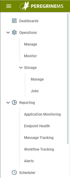  |
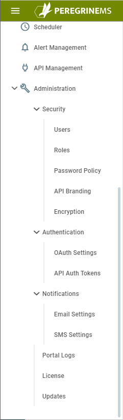 |
Each menu item points to a page that is a REST Style URL that you can bookmark or open in a new tab.
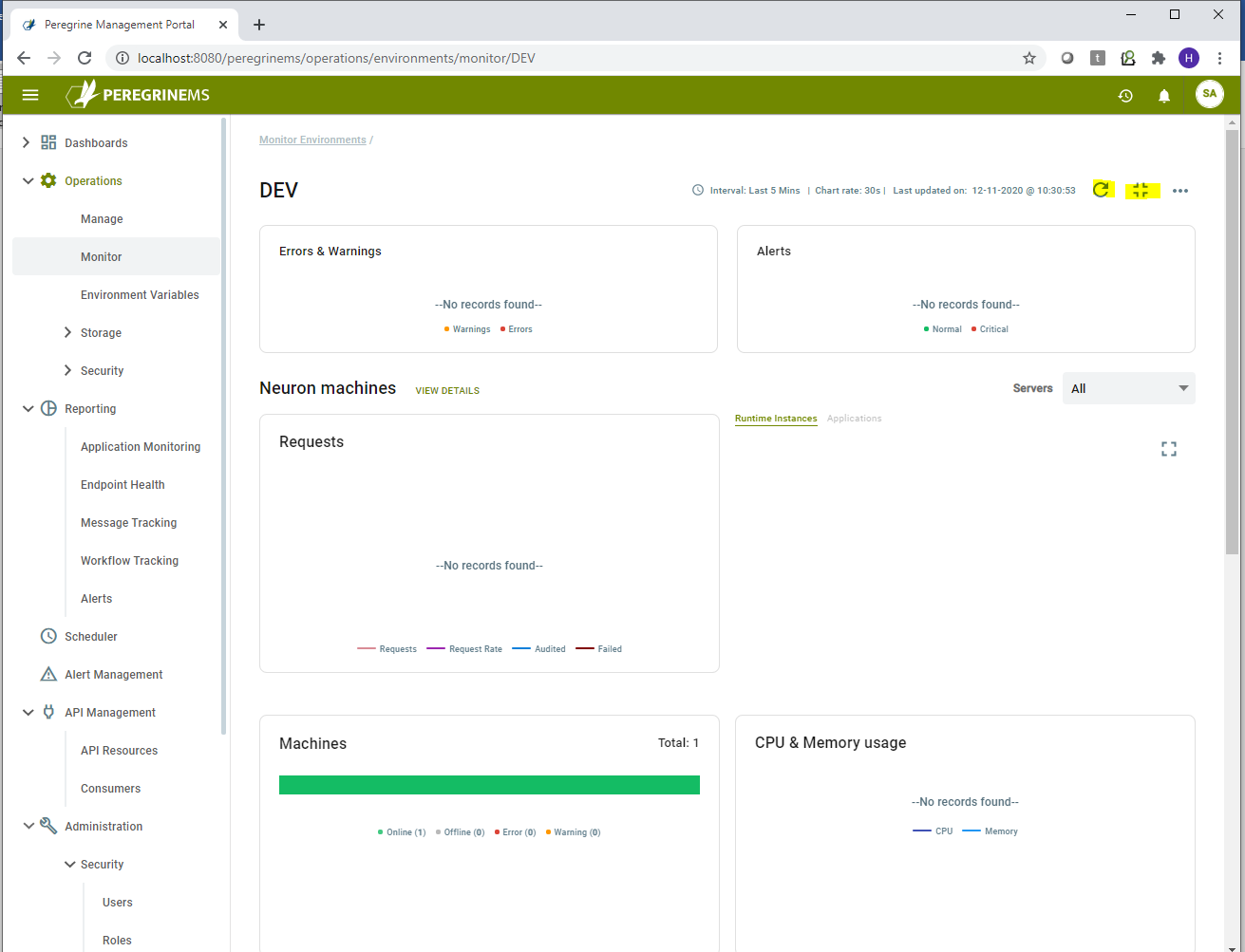
For example, https://localhost:8080/peregrinems/reporting/application/monitor/DEV points to application monitoring of DEV environment. It displays charts and stats for all applications running in the environment name DEV.
You can hide the left-hand menu by clicking the triple horizontal lines (also referred to as hamburger menu) to the left of Peregrine Management Suite’s logo. You may want to hide the left-hand navigation panel to gain more space when viewing lots of details on the right-hand pane.
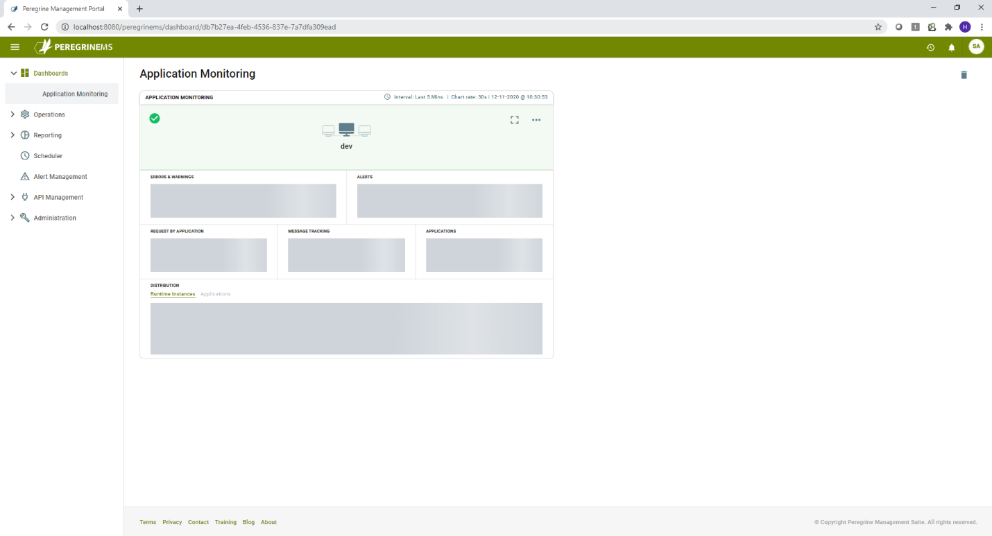
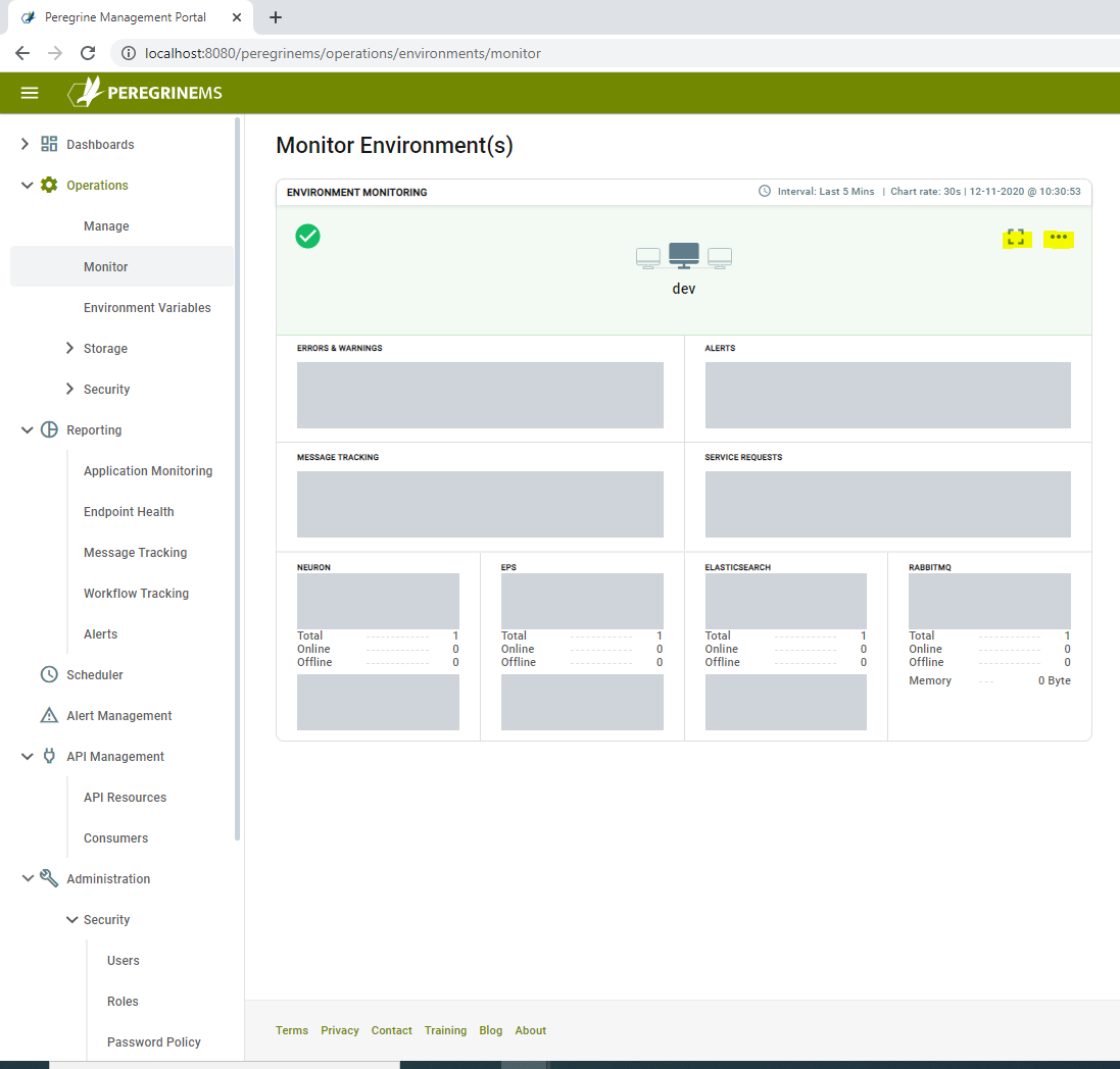
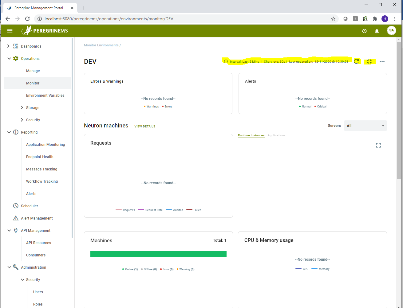
The right-hand pane pages display mini-panels referred to as cards. A page can display multiple cards. For example, the page below displays the card for DEV environment.
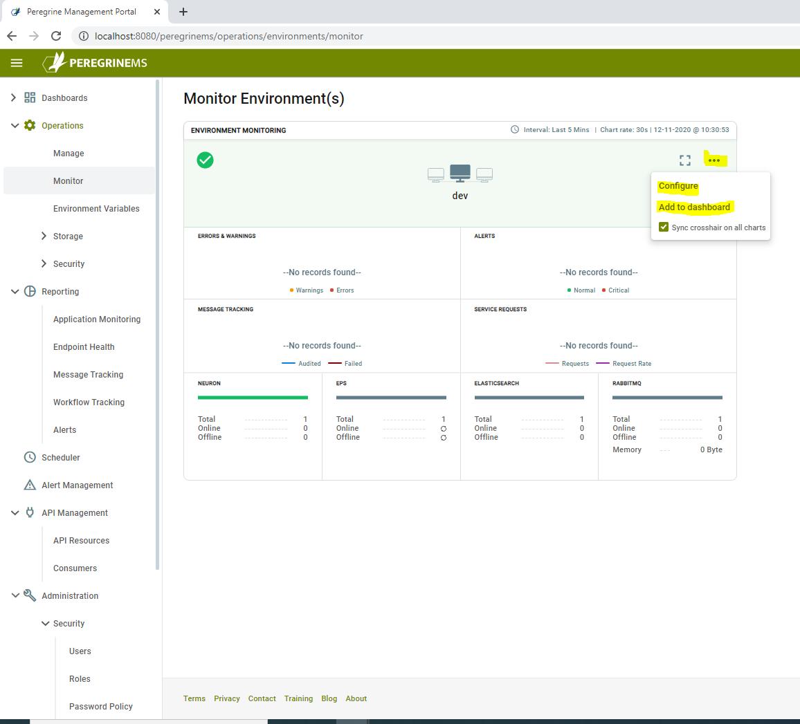
The yellow highlighted button that looks like a picture frame allows you expand the card view into a fully expanded view of that card. The ellipsis next to that button reveals a context menu that opens more specific pages and pop-up panels when you click on that. For example, in the page below, the context menu options are “Configure” and “Add to Dashboard”.
There is an option under the configure menu item called “Sync crosshair on all charts”. This option enables you to move your cursor over one chart on the page and remaining chart cross hair also move to the same point in time. This gives you the ability to get the complete picture across various indicators at a given point in time.
When viewing the expanded page, the frame icon changes to the crosshair icon that allows you to collapse the view back to the card view. To the left of that icon is the refresh icon. Clicking the refresh icon refreshes the page.
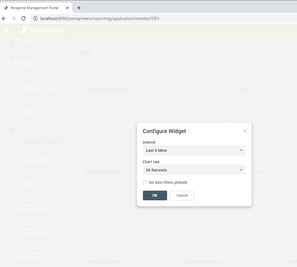
Most pages that display charts also show the time Interval for the charts shown, refresh rate and last refresh date time on the top left-hand corner. The context menu has an item called configure. Clicking this item open a pop-up window that can be used to change the interval and the chart refresh rate.
Most pages also have an option in the context menu shown as “Add to Dashboard”. Clicking this option adds the current view to the Dashboards. Remaining sections describe Dashboards in more detail.
There are other clickable items such as a filter dropdown box, buttons to add new items and other links to more specific details. These vary from page to page. When the mouse moves over the items that are clickable cursor changes to a hand shape indicating action can be taken on the item under the cursor that looks like this ![]() . A clickable item will display a tooltip indicating the action for clicking that item.
. A clickable item will display a tooltip indicating the action for clicking that item.
Other common controls and buttons
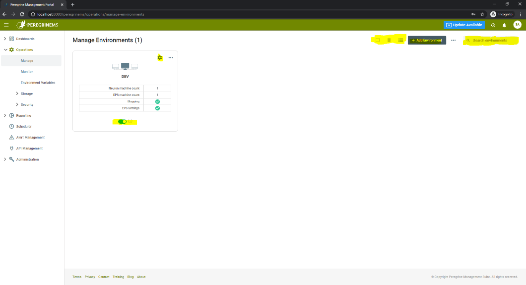
Some other common controls and buttons are shown in the page below. You can use the gear Icon button to configure options for the selected card. Use the power switch button to enable or disable the selected card. The first checkbox on the top right-hand corner is to select all items. The trash can icon next to it is to delete selected item. The list icon next to the trash can icon is to change the view from card view to list view. In a card view, the records are shown in form of panels containing important properties and options to drill down further. In a list view, the records are presented in a tabular format.
In addition, specific action buttons and search box let you quickly find the item you are looking for.
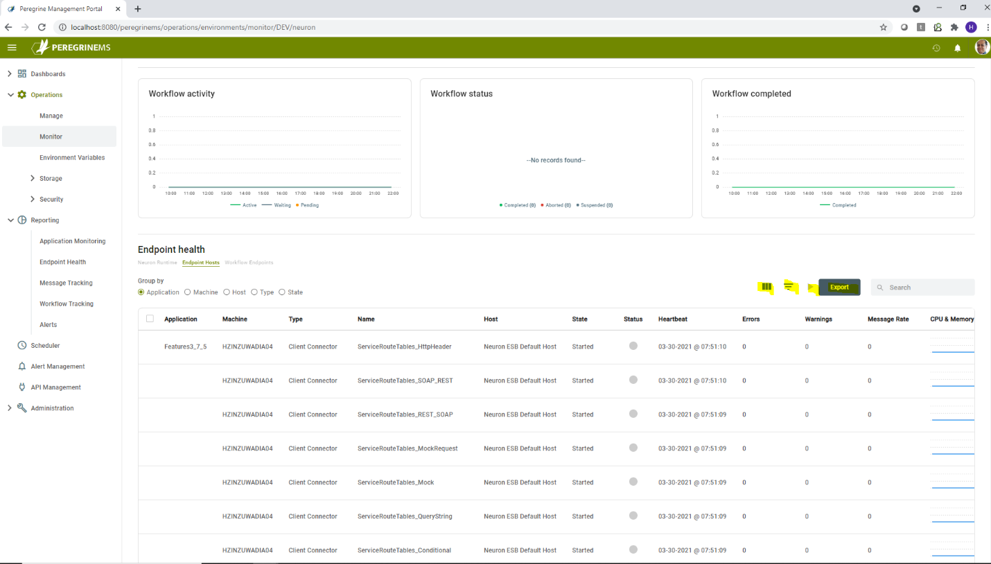
When a list view showing information in a tabular format is being displayed, additional controls appear on the top right-hand corner as shown below with highlights. The accordion icon is for adding/removing columns, the funnel icon is to display filter selection for each column, the play icon is for starting the selected item. The Export button exports the table content into a csv file or Excel spreadsheet. The search box on the right allows free form search of text entered through-out the table.
Settings
There is a common green ribbon of buttons for all Management Suite pages. This ribbon has the following buttons from left to right in the right-hand corner.

Recently Viewed
Displays last five most recently used URLs for ease of navigation.
Notifications
Displays notifications when alerts have been triggered for the logged in user.
Dashboards
As mentioned in the getting around section above, you can pin any of the Management Suite pages to a dashboard to provide a quick overview of all things that are of interest to the logged in user. Any number of Dashboards can be created to group related cards on the same page. On the Application Dashboard, you can see the various cards that you have added to the dashboard and then use them to navigate and drill down further.
The following page shows an example of an Application Monitoring Dashboard: